Introduction
This article is general for Shopify, BigCommerce, Wix, WooCommerce, Magento 1, Magento 2, and CS-Cart.
The Searchanise app allows customizing the appearance of its widgets using configuration settings or Custom CSS functionality. The following instructions will be helpful if you need to change the font size, adapt widgets’ design to your store’s theme, hide the price of a certain product, etc.
You need to have basic CSS knowledge to do some of the cases in the instructions. If you face any troubles, you can contact us.
We strongly recommend against the usage of external files to store Searchanise CSS styles. It can lead to the following issues:
- In case of theme updates, all edits you’ve made will be rewritten.
- If we redesign our app, we won’t be able to check if everything works fine with your own styles.
Customizing appearance
General
The Searchanise app consists of several widgets with their own settings and the possibility to customize CSS:
- Instant Search Widget
- Sticky Widget
- Search Results Widget
- Filters on collections/Smart Navigation (Shopify, BigCommerce)
- Recommendations (WooCommerce, Magento 1)
All Searchanise HTML elements contain the class starting with snize- prefix.
For correct CSS customization, you should view the current widget’s structure in your store through the web inspector in the Elements tab. In Google Chrome you can go to the web inspector by pressing the F12 key.
Common solutions
New CSS rules can be applied in the Search & Navigation > Instant search widget / Search results widget section > Custom CSS tab. Here are some common solutions for customizing CSS.
1. Adding the text to the product price
If you need to show text after a product price, add the following CSS rule:
.snize-price:after {
   content: " inc tax";
}
If you need to show text before a product price, add the following CSS rule:
.snize-price:before {
   content: "from ";
}
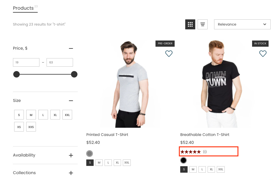
2. Changing the color of the review stars
You can change the default hex color of the review stars. To do so, add the CSS rule with your color for the Search Result Widget:
div.snize .stars-container:after, .snize-modal-content-wrapper .stars-container:after {
    color: #841911;
}
for the Instant Search Widget:
div.snize-ac-results .stars-container:after, .snize-modal-content-wrapper .stars-container:after {
    color: #841911;
}
Sticky Widget
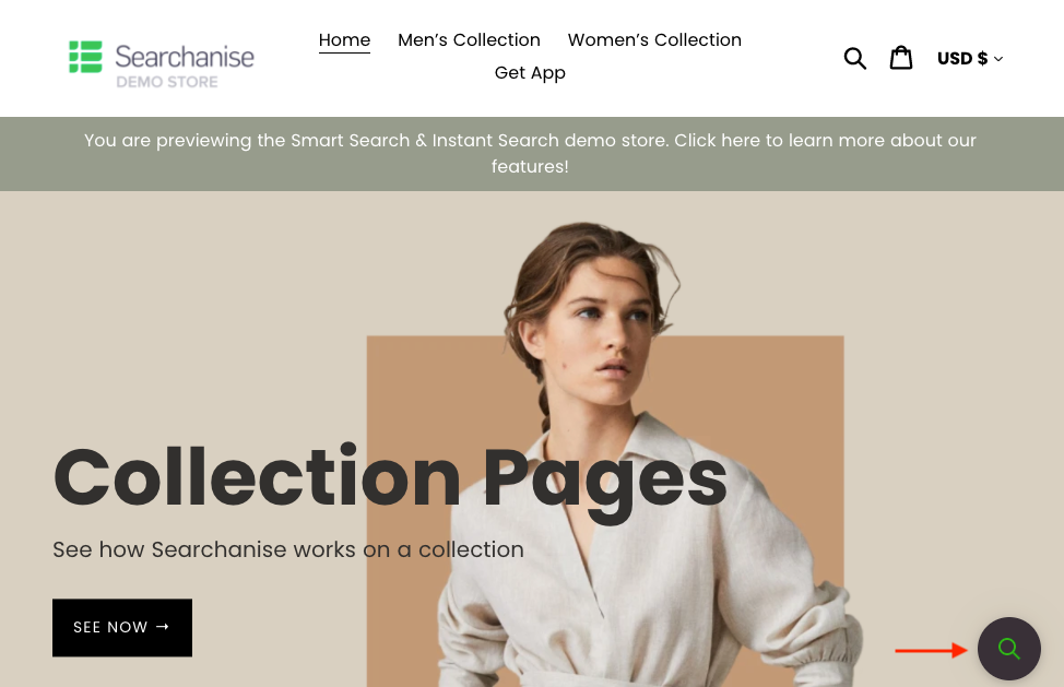
In case there is no a search bar in the theme layout, the Sticky Widget appears by default. It is a magnifying glass icon. You can change the Sticky Widget’s icon color in the Search & Navigation > Instant search widget section > Sticky widget tab or using Custom CSS.
To change the icon background color, paste the following CSS rule changing the color on the desired one:
a.snize-sticky-searchbox {
    background-color: #393037;
}
To change the icon color, paste the following CSS rule changing the color on the desired one:
.snize-sticky-searchbox .snize-search-magnifier {
    color: #12B415;
}
Instant Search Widget
You can hide or show price, price without discount, image, product description, and some other options in the Search & Navigation > Instant search widget section > Content tab. If you want to hide suggestions, pages, collections, or products, set the 0 value in the corresponding fields.
If those options aren’t enough, you can use Custom CSS in the Search & Navigation > Instant search widget section > Custom HTML & CSS tab.
The snize-ac-results class is used for the general container. The snize-ac-results-mobile class is added for mobile devices when the Optimize for phones and tablets option is enabled.
The snize-new-design class is added to the container in case the Big pictures template is set in the Template & Style tab.
The widget container automatically calculates its position based on the search bar position.
Section description
General container
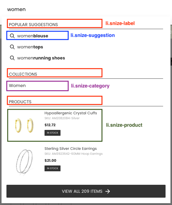
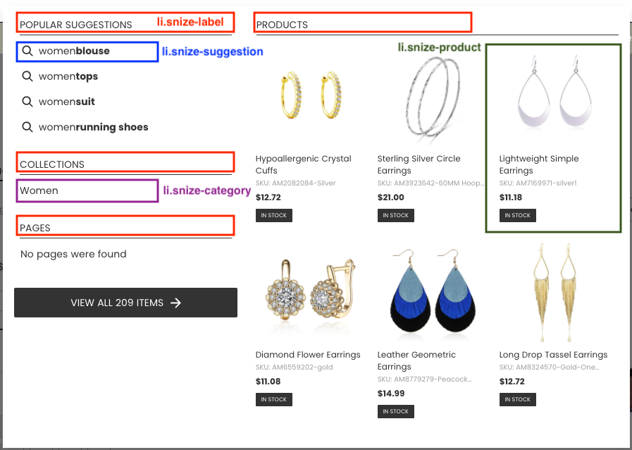
The general container wraps all other blocks in the drop-down widget. There are 2 template types for the general container (Single Column, Multi Column), which you can select in the Search & Navigation > Instant Search widget section > Template & Style tab.
Single Column template
Multi Column template
The Classic template is out-of-date. You can see it in the setting only if it is set up at the moment.
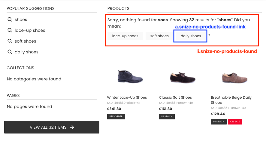
Did you mean
This block contains possible autocorrections for the user’s query and is displayed if the search query returns no results. The mentioned block isn’t displayed if the Auto spell correction option is enabled in the Search & Navigation > Preference section > Products tab.
Suggestions
You can specify what the app should display one-word suggestions or automatically generated suggestions in the widget’s settings in the Content tab.
Each suggestion is wrapped in a block with the snize-suggestion class.
Collections/Categories
Each category/collection is wrapped in a block with the snize-category class.
Pages
Each page is wrapped in a block with the snize-page class.
Products
Each product is wrapped in a block with the snize-product class and has an ID attribute with the snize-ac-product- prefix which contains the product’s ID.
For each discounted product the snize-price-with-discount class and the element with the discounted price are added to <span class=”snize-price”>. In case the Discount Label is showed, the label will be added to the <div class=”snize-product-label snize-product-discount-label”> element.
Nothing found
The Nothing found block is displayed when the search has found nothing. You can change the message in the Translations section.
Custom HTML
The settings, which are located in the Custom HTML tab, allow adding HTML blocks to the Instant Search Widget.
Show content on focus
This block is displayed when the cursor hovers over the search bar. Default settings:
<br><i>Start typing for instant search results</i><br><br>Extra content
This block is displayed after the last block which is set in the Instant search widget section > Content tab > Search results order setting. Default value:
<div style="text-align: center;">
    <a href="#" title="Exclusive sale">
        <img src="https://www.searchanise.com/images/sale_sign.jpg" style="display: inline;" />
    </a>
</div>
“Nothing found” content
This block is displayed when nothing has been found.
Default settings:
<p>Sorry, nothing found for [search_string].</p>

<p>Try some of our <a href="#" title="Bestsellers">bestsellers →</a>.</p>
Customization examples
1. How to change the color of a product title?
Look for the Title palette in the Search & Navigation > Instant search widget section > Template & Style tab and change its color.
2. How to display a mobile widget upon clicking on the icon?
Add the snize-custom-widget-opener class to the necessary element. The example:
<i class="icon-search snize-custom-widget-opener" ..>3. How to disable Searchanise in certain search boxes or certain themes?
Add the snize-exclude-input class to the search text box, for example:
<input class="snize-exclude-input" ..>To enable Searchanise only in one theme of your store, you need to add the snize-exclude-input class to all search input fields in all themes, except the one you need.
4. How to hide the price of a certain product?
Add the following CSS rule and replace <ID> with the ID of the necessary product:
#snize-ac-product-<ID> .snize-price-list {
    visibility: hidden;
}
If you use Shopify, you can find the product ID in the Shopify admin panel on the product page in the address bar. An example of the product ID: shop.myshopify.com/admin/products/3708537765993. The product ID is the last numeric part.
Look for the “View all” text, “View all” background palettes in the Instant search widget section > Template & Style tab, and change their colors.
Search Results Widget (+Filters on collections/Smart Navigation)
The widget’s settings are located in the Searchanise (Smart Search Bar & Filters) control panel > Search & Navigation > Search results widget section. If these settings are not enough, you can use Custom CSS.
We use the same appearance settings in the Filters on collections (Smart Navigation) widget, the differences between them are:
-
It doesn’t show pages and categories/collections, only products of a category/collection.
-
The main panel with tabs (Products, Categories/Collections, Pages) is hidden.
-
The Collection/Category filter is disabled.
Sections description
General container
This container wraps around all other blocks. The snize-options class is added to the container in case of the Display options swatches option is enabled in the Content tab. If Filters on collections (Smart Navigation) is enabled, the snize-collection-mode class is added to the general container on category/collection pages.
The snize-search-results class is added for the general container. The snize-mobile-design class is added for mobile devices.
The snize-new-version class is added to the container in case of the new Big pictures template (not Classic) is set in the Template & Style tab (on the Wix platform, it is not added).
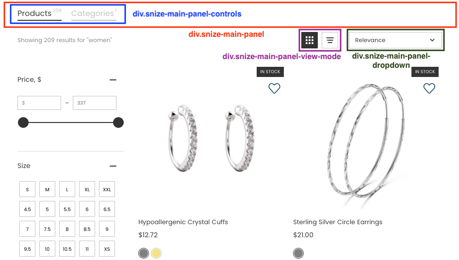
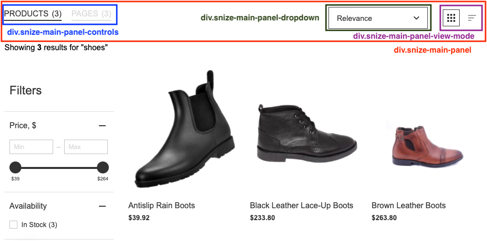
Main panel
The main panel contains tabs for products, collection/category, and page navigation.
It also contains the sorting drop-down list and the Grid/List view icons for the Modern and Big pictures classic templates and on the Wix platform.
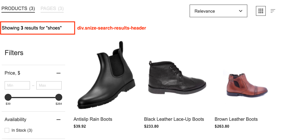
Heading
It contains text with the number of found products.
Filters
Desktop
Filters can be displayed at the top of the widget and on the left side. You can choose which set of filters to show or hide in the Search Results widget section > Filters tab. You can also disable showing filter variants with no results in the settings.
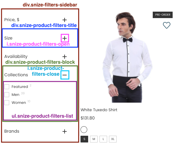
The image below shows CSS of left side filters schematics:
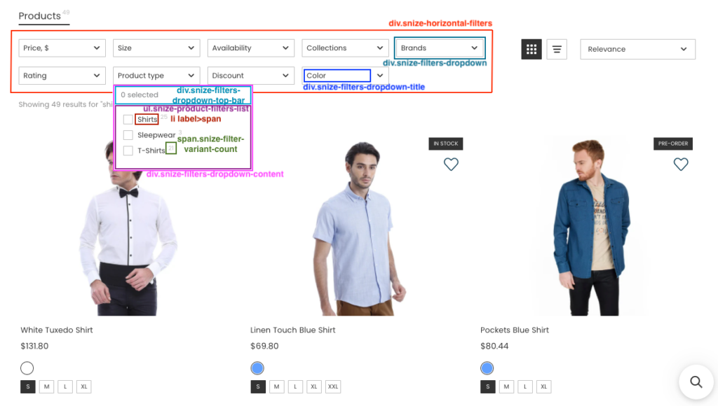
The image below shows CSS of top filters schematics:
Mobile
A different structure is used for Filters on mobile devices. They are displayed in the pop-up window.
CSS selectors:
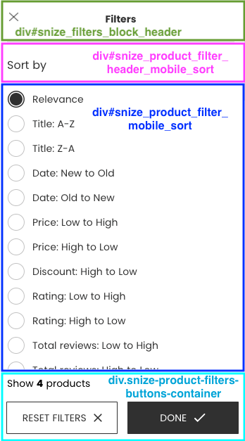
- #snize-modal-mobile-filters-dialog – the filter pop-up window on a mobile device
- #snize-modal-mobile-sortby-dialog – the sorting pop-up window on a mobile device (for the Modern and Big pictures classic templates and on the Wix platform)
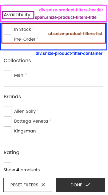
The block with the .snize-product-filter-container class contains filter values.
The image below shows CSS schematics for the “Big pictures” template:
Products
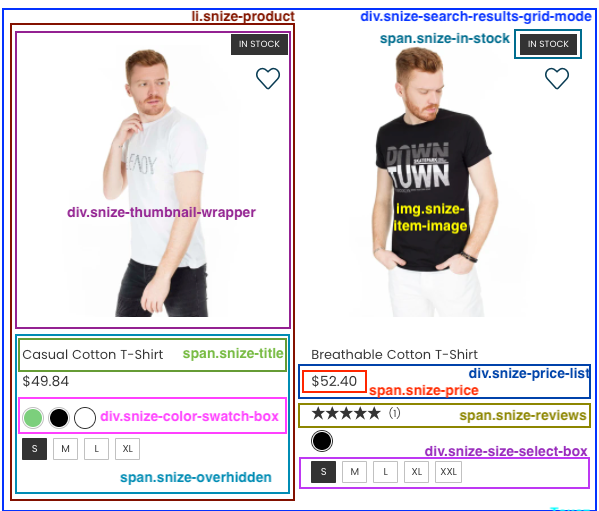
Each product is wrapped into the block with the snize-product class and the snize-product-<ID> ID attribute. The Searchanise settings allow you to adjust the number of strings in the product description and title and the number of products shown per page.
The Grid layout uses the snize-search-results-grid-mode ID attribute.
The number of columns for the Grid layout is defined by the snize-one-column, snize-two-columns, snize-three-columns, snize-four-columns, snize-five-columns classes. The class selected is defined by the page width.
The List layout uses the snize-search-results-list-mode ID attribute.
The image below shows CSS schematics:
Quick view
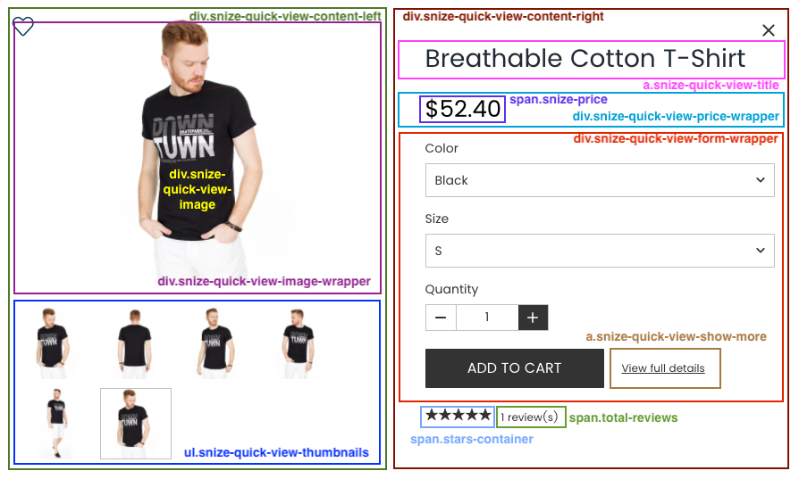
You can show the Quick View button for products. After clicking the Quick View button, the pop-up window with product images, quantity, and option variants appear.
The snize-modal class is added for the general container.
The image below shows CSS schematics:
Pagination
There are two more pagination methods besides the common numeric pagination variant: Endless scrolling and the Show more button. You can change the pagination method in the Search & Navigation > Search Results widget section > Content tab.
You can change the colors of the Show more button in the settings. To do so, change the “Show products” text, “Show products” color palette in the Searchanise control panel > Search & Navigation > Search results widget section > Template & Style tab.
For the Big pictures template (not for the Wix platform), you can change the color of the highlighted page of the common numeric pagination variant in the settings. To do so, change the Pagination highlight palette in the Searchanise control panel > Search & Navigation > Search results widget section > Template & Style tab.
Customization Examples
1. How to change product price color?
Change the Product price palette in the Search & Navigation > Search Results widget section > Template & Style tab.
2. How to change the number of products per row?
You should look for the instructions on how to do so here.
3. How to hide the number in the brackets of filter values?
Add the following CSS rule:
div.snize ul.snize-product-filters-list .snize-filter-variant-count {
    display: none;
}
4. How to hide the number in the brackets of tab headers?
Add the following CSS rule:
div.snize div.snize-main-panel-controls ul li a span {
    display: none;
}
5. How to change the element to which the page scrolls up/down after updating the widget (for example, after selecting a filter variant)?
Add the snize-results-custom-scroll class to one of the elements to which the page will scroll.
For example, add the snize-results-custom-scroll class to the <body> tag to make the page scroll to the top:
<body class="snize-results-custom-scroll" ..>Recommendations
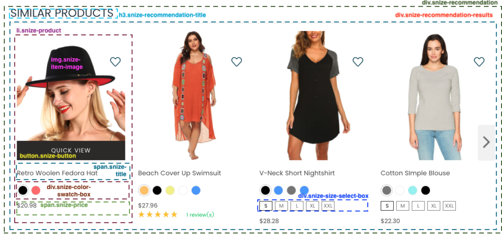
You can find a default set of customization settings in the Searchanise control panel > Merchandising & Promo > Recommendations section > Settings tab. If it is not enough, you can enable the Custom CSS option and paste your CSS rules.
The snize-recommendation class is added for the general container. The snize-mobile-design class is added for mobile devices.
Section description
The image below shows CSS schematics:
General container
This container wraps around the product block.
The widget contains the searchanise-recommendations class and a unique ID. Navigation arrows are located on the left and right sides.
Products
The HTML structure is the same as the HTML structure for products in the Search Results Widget.
We’d appreciate it if you could take some time to leave a review. To do so, follow the link to your respective platform below:


