
This article is general for WooCommerce, Magento 1, and Magento 2.
The Button element is a Call-to-Action (CTA). CTAs guide customers on what to do next — view a product, add it to the cart, or make a purchase.
In the Search Results Widget, you can choose where CTA buttons appear in the product card and adjust their placement to fit your store’s design.
You can keep the default layout with one CTA button
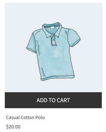
Or select another layout with different CTA placements:
-
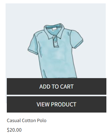
Stacked buttons below card — buttons stacked vertically at the bottom of the product card.
-
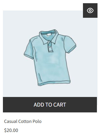
Add to cart below, View product top-right icon — the Add to Cart button below the image, View product as an icon at the top-right of the product image.
-
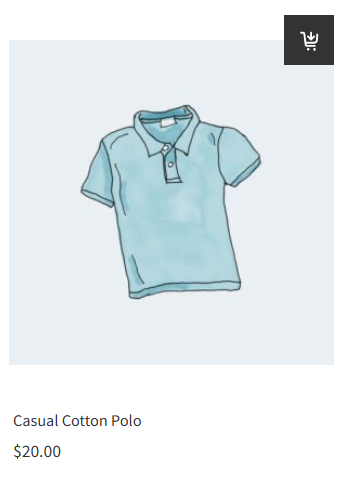
Add to cart top-right icon — the Add to Cart button as an icon at the top-right of the product image.
-
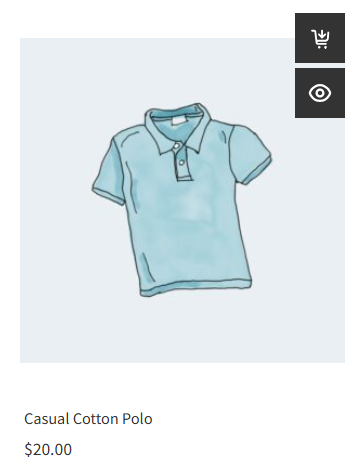
Vertical icons top-right — buttons as icons stacked vertically at the top-right of the product image.
Adjust the default CTA placement
The default layout includes a single CTA button; alternatively, you can hide all buttons.
To adjust the default CTA button design and placement, follow these steps:
- Go to the Searchanise Search & Filter control panel > Search & Navigation > Search results widget section > Content tab > Products part.
- Select the Default layout value in the CTA placement setting if you have selected another layout.

- Select one of the options in the Show CTA button drop-down list.
- If needed, change other sub-settings for the default layout.
- Apply the changes.
| Option | Description |
|---|---|
| Show CTA button | Allows selecting the CTA button to display in the product card or hiding all buttons. Options:
|
| Show button when hovering | Available for Desktop only. If this setting is turned on, the CTA button will show only when you hover over the product card. |
| Show CTA button on device | Allows selecting where the button appears: on desktop, mobile, or just on a single device. |
| Button type | Allows selecting whether the button text only or text with an icon. |
| Button shape | Allows selecting a button shape that suits your design. |
Adjust the other CTA placements
If you want to display two CTA buttons or display a CTA button as an icon, there are various CTA placement layouts to do so. To change the CTA placement, follow these steps:
- Go to the Searchanise Search & Filter control panel > Search & Navigation > Search results widget section > Content tab > Products part.
- Select the layout in the CTA placement setting.
- If needed, change the sub-settings for the CTA buttons.
- Apply the changes.
| Option | Description | Layouts |
|---|---|---|
| Show “Add to cart” button on device | Allows selecting where the Add to cart button appears: on desktop, mobile, or just on a single device. | All layouts |
| Show “View product” button on device | Allows selecting where the View product button appears: on desktop, mobile, or just on a single device. |
|
| Show button when hovering | Available for Desktop only. If this setting is turned on, the CTA buttons will show only when you hover over the product card. | All layouts |
| Button type | Allows selecting whether the buttons text only or text with an icon. |
|
| Button shape | Allows selecting the button’s shape that suits your design. | All layouts |
You can translate or edit the buttons’ text in the Translations & Texts section > Search results widget tab. You can customise the buttons’ colors in the Search & Navigation > Search results widget section > Template & Style tab.
We’d appreciate it if you could take some time to leave a review.
