Our Upsell and Cross-Sell functionality is now limited: you can no longer create new recommendation blocks.
However, all of these features are fully available in our Searchanise app for Shopify.
You can change recommendation widgets’ appearance by applying custom CSS rules in the Searchanise Upsell & Marketing admin.
Steps:
-
- From your Shopify admin, go to the Searchanise Upsell & Marketing admin.
- Open the Upsell & Cross-Sell app.
- Switch to the Content & Style tab.
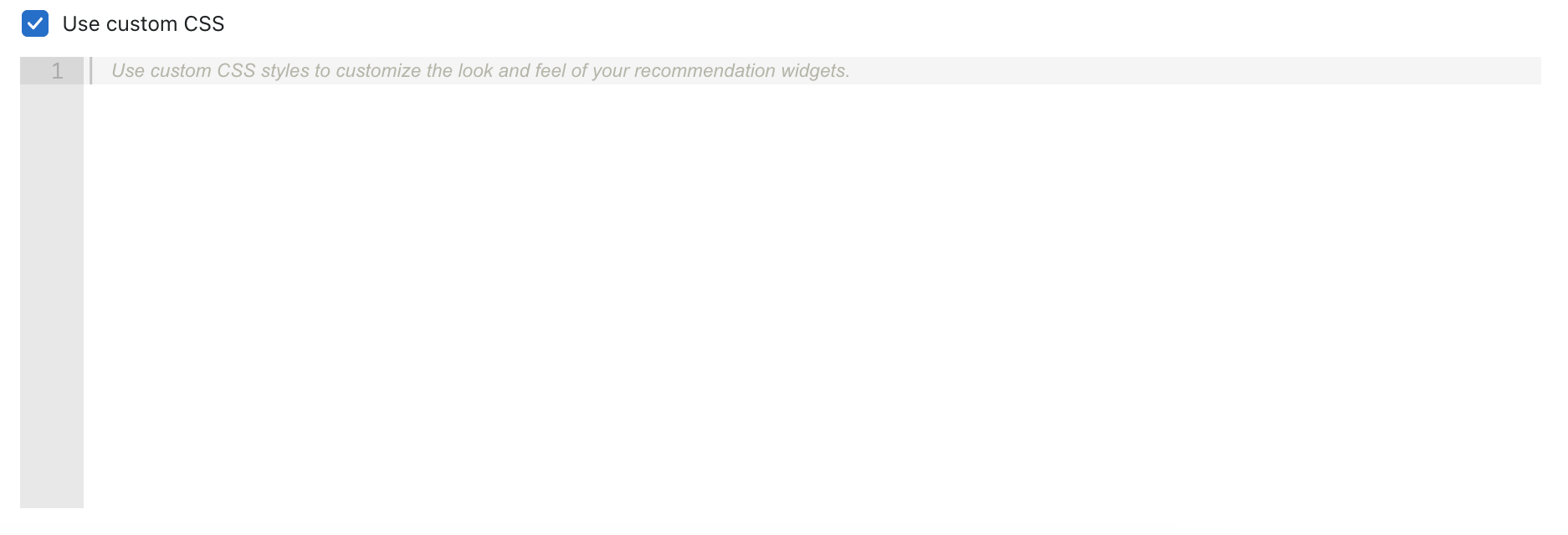
- Check the Use custom CSS box.
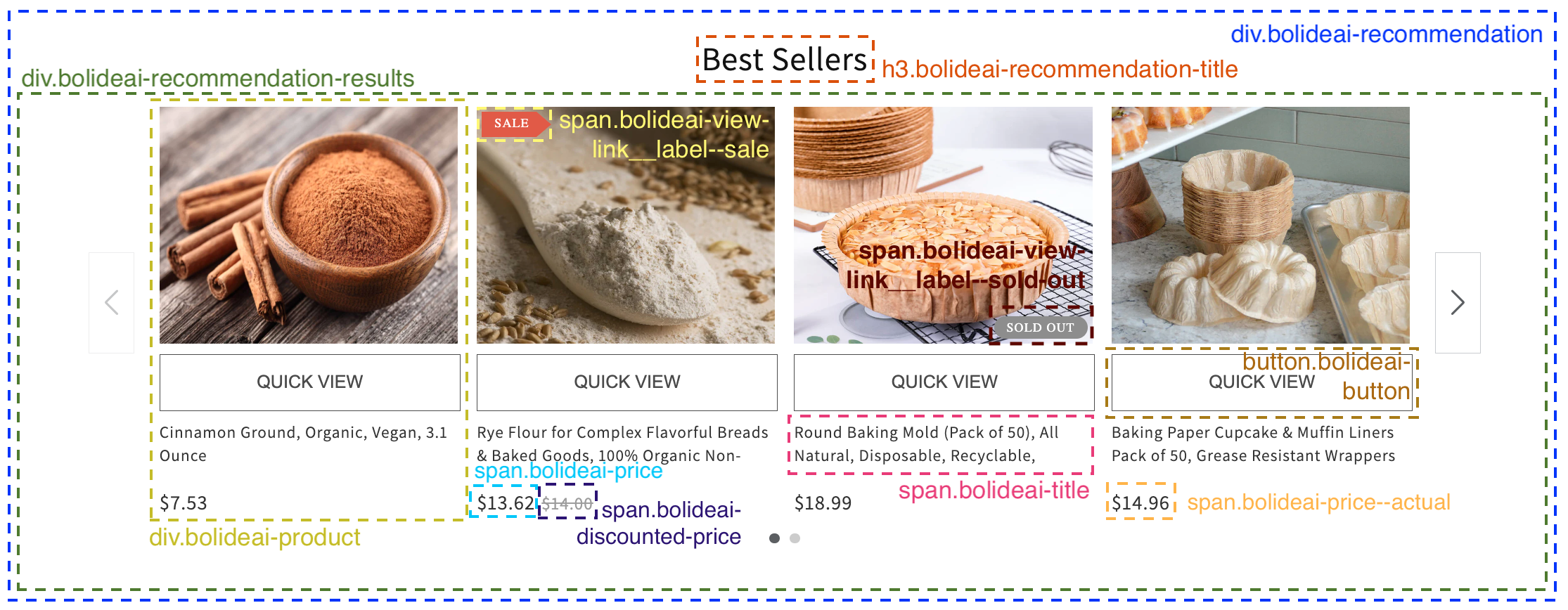
To modify CSS rules, specify selectors and their classes for each HTML widget element. For your convenience, the image below shows CSS schematics. You can use it for your configuration.
If you want to change the navigation elements’ style, refer to the following selectors:
- div.swiper-button-prev is used for the back arrow
- div.swiper-button-next is used for the forward arrow
- div.swiper-pagination is used for pagination dots
After you save the changes, wait a moment for them to be applied. If nothing has changed, try raising the CSS property priority by adding the specificity level of a selector. See examples below.
Common custom CSS cases
You can use the examples below to configure your widget appearance:
1. To change the widget header appearance, apply these rules:
div.bolideai-recommendation .bolideai-recommendation-title {
font-family: Times New Roman !important;
font-size: 40px !important;
color: #48634B !important;
}
2. To change the widget product title appearance, apply these rules:
.bolideai-recommendations-big-pictures-new-layout div.bolideai-recommendation-results span
.bolideai-overhidden .bolideai-title {
font-family: Times New Roman !important;
font-size: 20px !important;
color: #48634B !important;
}
3. To change the widget product price appearance, apply these rules:
.bolideai-recommendations-big-pictures-new-layout div.bolideai-recommendation-results
.bolideai-price-list .bolideai-price {
color: #48634B;
font-size: 20px;
font-family: Times New Roman !important;
}
4. To change the widget slider container appearance, apply these rules:
a) Replacing carousel template with grid:
.div.bolideai-recommendation-results .swiper-wrapper {
height: auto !important;
display: grid !important;
grid-template-columns: auto auto auto auto !important;
}
b) Hiding pagination and arrows:
div.swiper-button-next, div.swiper-button-prev, div.swiper-pagination {
display: none !important;
}
5. To change the widget product thumbnail size, apply these rules:
div.bolideai-recommendation-results .bolideai-thumbnail-wrapper span.bolideai-thumbnail {
height: 200px !important;
}
6. To change the button on the product appearance, apply these rules:
a) Configuring button position on the product thumbnail:
.bolideai-recommendations-big-pictures-new-layout div.bolideai-recommendation-results div.bolideai-product
div.bolideai-item span.bolideai-overhidden button.bolideai-button {
position: absolute;
top: -120px;
box-sizing: border-box !important;
width: 100%;
height: 45px;
}
b) Customizing the button appearance:
.bolideai-recommendations-big-pictures-new-layout div.bolideai-recommendation-results div.bolideai-product
div.bolideai-item span.bolideai-overhidden button.bolideai-button {
background: #EBDC99 !important;
color: #698747;
opacity: 85%;
box-shadow: 0 8px 16px 0 rgba(0,0,0,0.2), 0 6px 20px 0 rgba(0,0,0,0.19);
}
c) Hiding the button display on mobile:
@media screen and (max-width: 768px) {
.bolideai-recommendations-big-pictures-new-layout div.bolideai-recommendation-results
div.bolideai-product button.bolideai-button {
display: none !important;
visibility: hidden !important;
}If you need assistance customizing your CSS rules, reach out to support@bolide.ai. We will help you with the configuration.


