This article is general for Shopify, BigCommerce, Wix, WooCommerce, Magento 1, and Magento 2.
This article explains how the Instant search widget and Search results widget are displayed on mobile devices and which mobile-specific settings are available.
Instant search widget
By default, the Instant search widget opens as a full-screen overlay on screens narrower than 820 px. You can change this breakpoint in Search & Navigation > Instant search widget > Content > Search modal > Custom breakpoint.
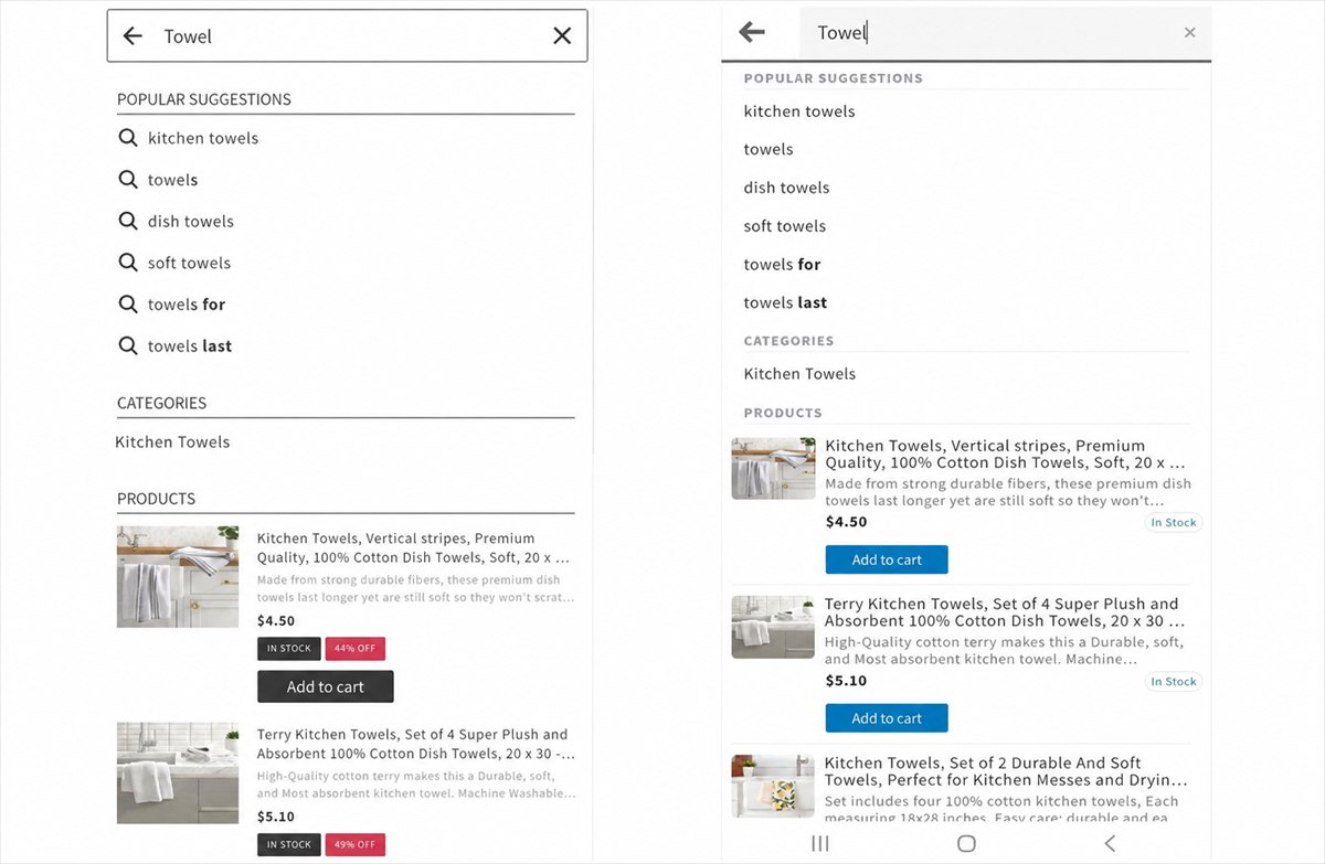
The mobile version always uses a single-column layout, even if you select a multi-column template in Search & Navigation > Instant search widget > Template & Style.
The examples below show the Instant search widget with the Big pictures template (left) and the Modern template (right).
Search results widget
Layout
The available product layouts on mobile devices depend on the selected template.
Big pictures template
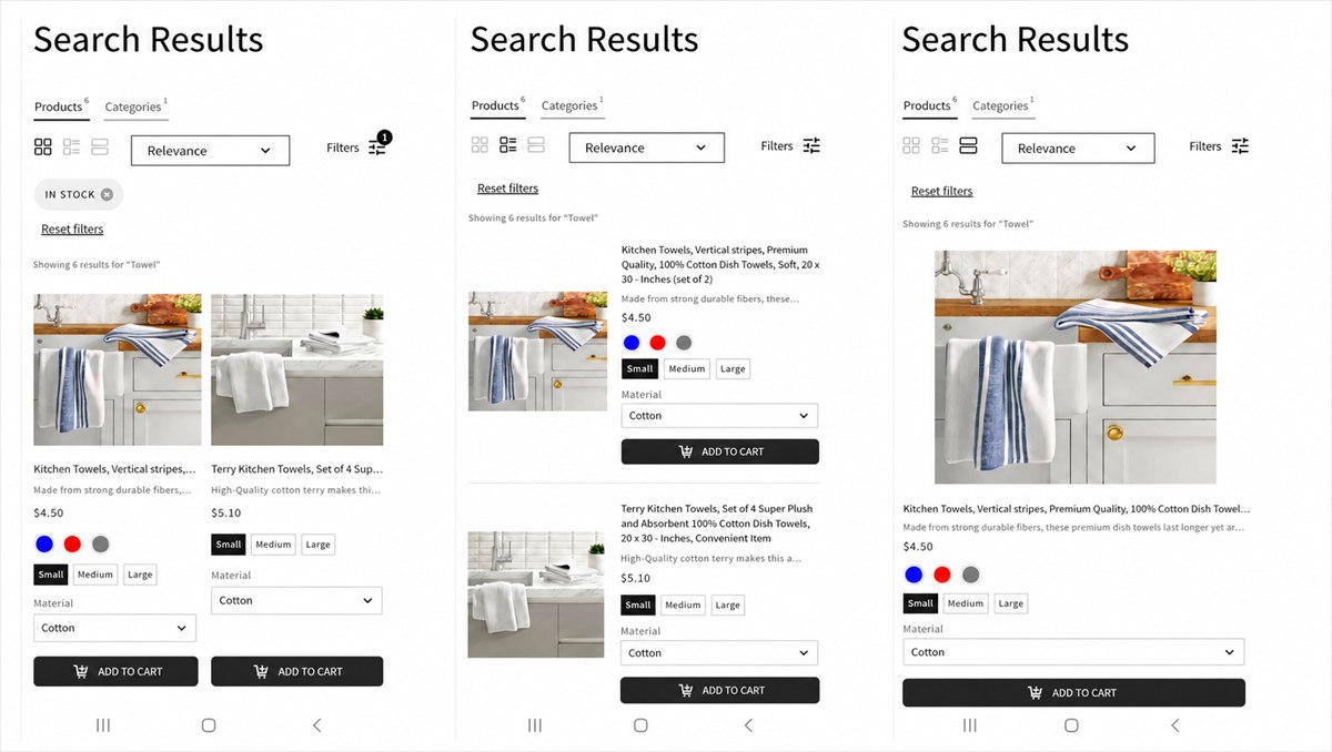
With the Big pictures template, customers can switch between three product layouts using the layout selector in the upper-left corner of the search results:
- Grid — products are displayed in two columns. Each product image appears above its description, options, and CTA button. Each product card takes up approximately half of the screen width.
- List — products are displayed in a single column. The product image appears on the left, while the description, options, and CTA button appear on the right.
- Big picture — products are displayed in a single column. The product image appears above the description, options, and CTA button, and the product card uses the full screen width.
You can change the default mobile layout in Search & Navigation > Search results widget > Content > Default mobile view.
Other templates
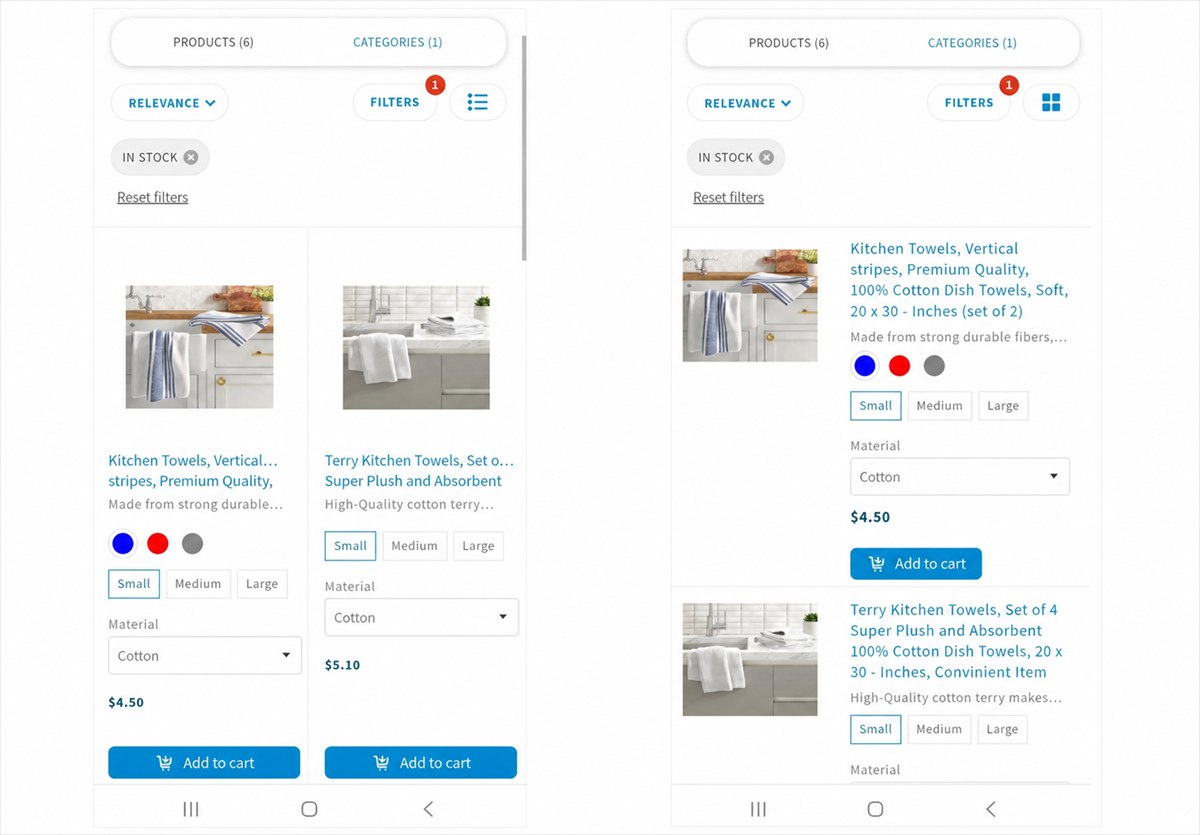
For other Search results widget templates, the available mobile layouts are Grid and List (in the upper-right corner).
CTA button
You can control whether the CTA button (Quick view, Add to cart, or View product) is displayed on desktop and mobile devices using: Search & Navigation > Search results widget > Content > CTA placement > Show CTA button on device
The following options are available:
- Desktop only
- Mobile only
- Desktop and mobile — default
Filters
With the Big pictures template, you can choose whether filters are Collapsed or Expanded by default on mobile devices. You can change this setting in Search & Navigation > Search results widget > Filters > Settings > Default mobile view.
For other templates, filters are collapsed by default on mobile devices.
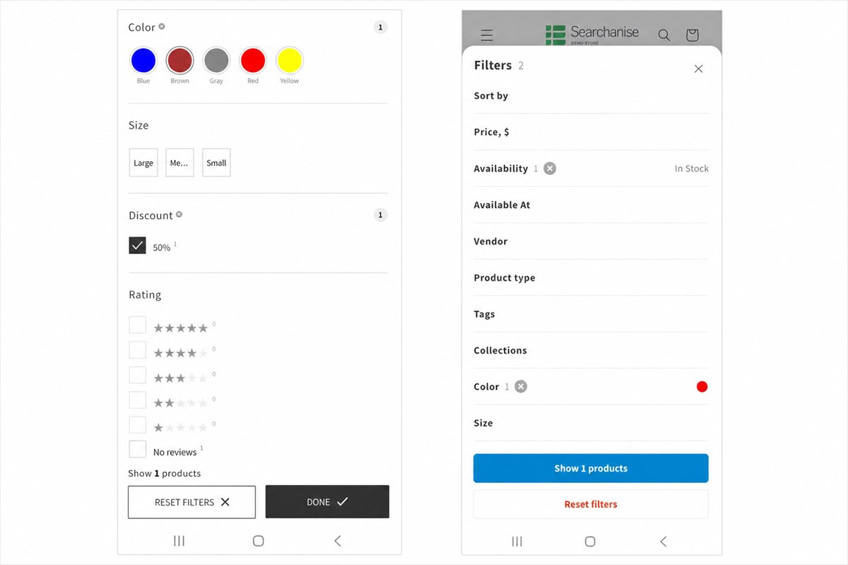
You can configure the mobile display of each filter individually in Filters > Filter list > Edit filter > Settings:
- Show on mobile — shows or hides the filter on mobile devices.
- Default mobile view — sets the filter as Expanded or Collapsed.
Sorting
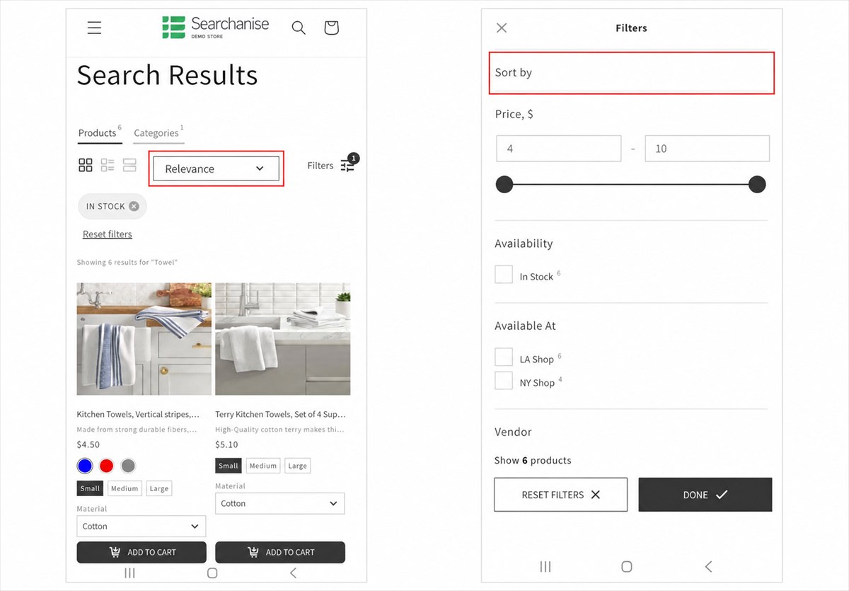
On mobile devices, the sorting control can be displayed either directly on the search results page or as the first option in the filters. You can configure its placement in Search & Navigation > Search results widget > Filters > Settings > Sorting on mobile.